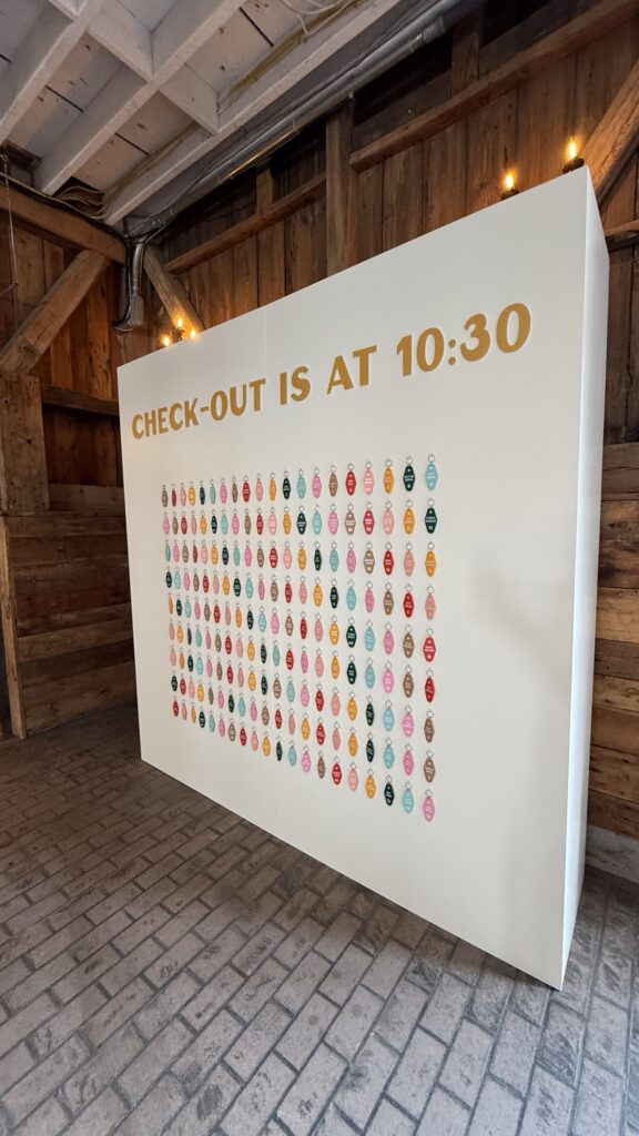
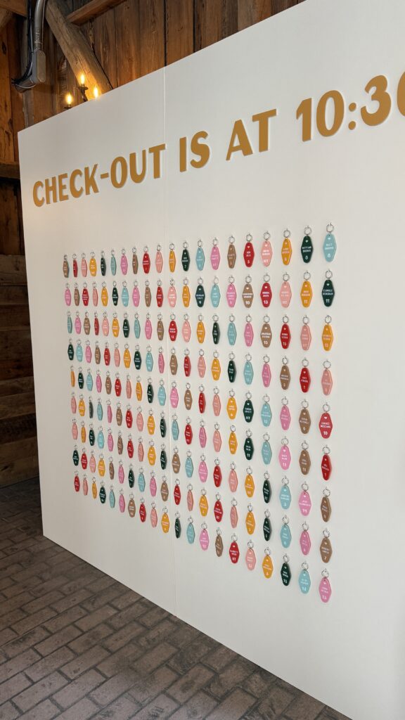
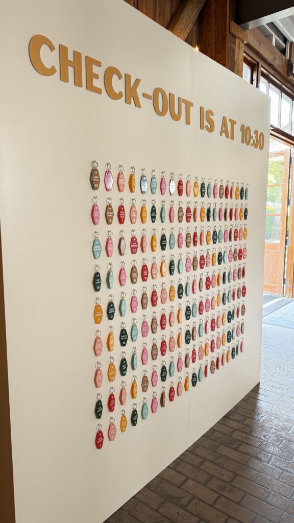
When a planner tells us a couple wants their wedding to feel like summer camp—but with a colorful, nostalgic twist—you know we’re all in. This seating chart was one of our favorite statement pieces this season, and we had so much fun bringing it to life from concept to install.
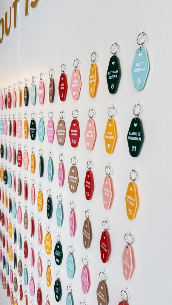
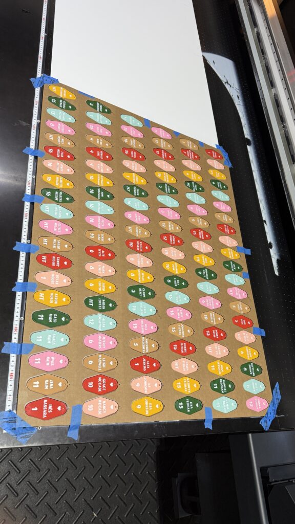
The idea started with a love of vintage motel keychains—those chunky plastic tags that feel straight out of a lakeside cabin in the ‘70s. We designed each one with a pop of retro color and printed them in-house on our flatbed UV printer. It gave us the freedom to customize every detail, from the room numbers (aka table numbers) to guests’ names, all in bold white ink that really pops.
The finished look was playful, practical, and totally unexpected. Guests got a kick out of finding their name and “room,” and it doubled as a super fun favor they could take home.
As with everything we create, it was designed to reflect the couple’s personality and set the tone for the celebration ahead.
Scroll for some behind-the-scenes peeks at the process.
Want to chat about something custom for your own wedding? We’d love to help you dream it up.
—
Venue: Summerfield Farms
Planning: ABBA Design
Ready to create your own one-of-a-kind seating display?
Contact us here or view more of our signage here.
Comments +